How to use the Compare tool
With the "Compare" tool you can examine two or more symbols simultaneously. This allows you to benchmark one asset against another, spot correlations, or assess the market's health.
For example, you can compare the SPY, DIA, and QQQ. The result is one single chart containing easy-to-read, relevant information spanning the entire market.
Another way to use this tool is to compare two companies within the same sector.
For example, two automobile companies — General Motors and Ford. By doing so, you can narrow your research and gain a better understanding of the two major players within a single sector.
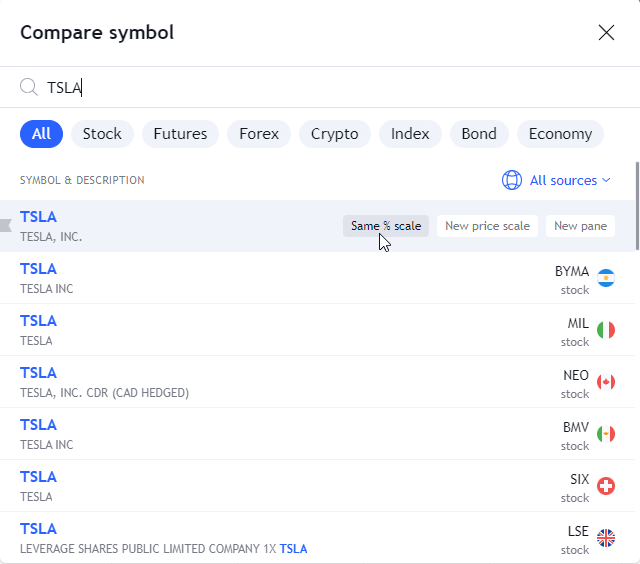
! Note: When you add a symbol to a chart, the vertical axis will change from price to percentage.
The percentage shown is the price movement for whatever period is currently visible on the chart. This is absolutely necessary. If you switch it back to price, the chart will collapse unless the price values of the symbols are very close to each other.
Below is an example of a Google and Apple comparison chart when switched back to price. Their prices are about $500 apart. As a result, when you switch to price, both data series flatten out and the chart loses its effectiveness.
To add a comparison to your current data series/chart, simply click on the "Compare or Add symbol button" on the toolbar along the top of the chart.

Several popular symbols are already listed, which you can select to add to the chart. However, you can add any symbol for your analysis.
Also read: